Flagship label foundation
Created a more ownable and elevated label direction for Market Vineyards Rosé.
Packaging & Print
A wine label and brand refresh system for Market Vineyards, beginning with a flagship Rosé and extending into the bolder Unicorn Red Wine follow-up.
Challenge
Market Vineyards needed a label for its flagship Rosé that could feel premium, distinctive, and flexible enough to influence future wine releases. The early direction leaned heavily on an existing reference from another winery, so the project needed to move toward something more proprietary. The label also had to balance shelf presence, elegance, legal requirements, production constraints, and the client's desire for a refined winery identity.
Approach
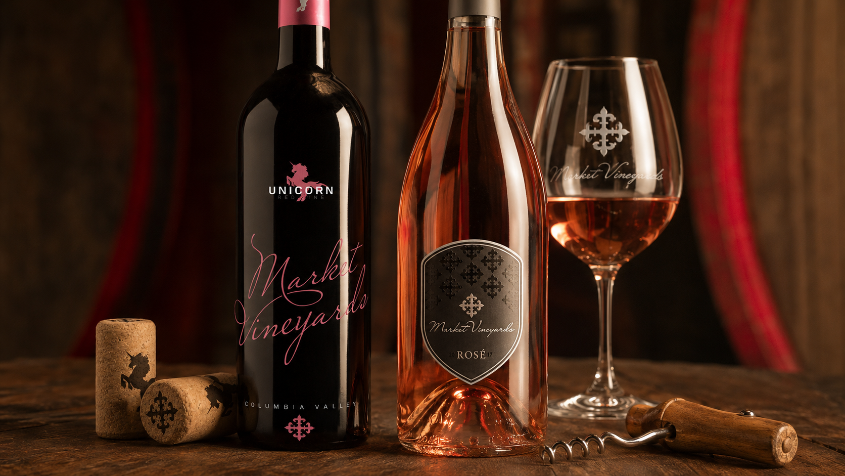
For the Rosé, I moved the design away from the expected white-label category look and built a darker, more elegant label system around contrast, restraint, and specialty print details. The black label helped the bottle stand apart from other rosés while still feeling sophisticated. The crest shape, subtle pattern work, silver detailing, and restrained rosé accents gave the bottle a more premium presence without overpowering the color of the wine. I also refreshed the Market Vineyards logo by simplifying the color palette and adjusting the typography to better match the elevated label direction. The back label required a different kind of design problem. It needed to satisfy alcohol-label requirements while staying visually connected to the front label and remaining smaller so it would not compete with the primary design. Unicorn Red Wine became the follow-up release. It used a bolder visual approach with bright red/pink typography, a unicorn mark, and a more expressive script treatment. The design kept Market Vineyards visible while letting the wine's personality feel more playful, modern, and memorable.
The Market Vineyards label work began with a premium Rosé system and expanded into Unicorn Red Wine, giving the winery two distinct product expressions under one refined brand foundation.
The Rosé label went through several strong design directions before arriving at the final solution. Early concepts explored shelf impact, script typography, badge structure, and production details. This process was especially meaningful because some of the expressive ideas that were not selected for Rosé later became the foundation for Unicorn Red Wine.
One of the most interesting outcomes of this process was that an early direction that wasn't right for the Rosé eventually found its perfect home in Unicorn Red Wine, turning this project into a broader label system evolution rather than a one-off packaging design.
The Rosé label used a dark crest, subtle patterning, silver detailing, and restrained rosé accents to create a more distinctive premium presence in a category often dominated by light labels.
The project included a Market Vineyards logo refinement and production-ready front and back label files, including legally required alcohol-label information and vendor-ready artwork.
Unicorn Red Wine pushed the system into a more expressive direction, using bold red/pink typography, a unicorn mark, and a playful script treatment while still keeping Market Vineyards visible.
What I owned
Why it mattered
The Rosé label gave Market Vineyards a more ownable and elevated visual foundation. Unicorn Red Wine showed that the system could stretch into a more playful and distinctive release without losing the winery's identity. This is a personal favorite because it combined brand refinement, packaging craft, print production, and expressive product personality in a way that felt both polished and genuinely fun.
Outcomes
Created a more ownable and elevated label direction for Market Vineyards Rosé.
Refreshed the winery logo and label hierarchy to better support a premium product expression.
Extended the visual language into Unicorn Red Wine with a bolder, more playful follow-up release.
Balanced shelf presence and expressive design with bottle selection, specialty print methods, vendor proofing, and alcohol-label requirements.