Clearer navigation
Made a complex educational product lineup easier for educators and administrators to scan, compare, and understand.
Editorial
A catalog redesign that turned a complex educational product lineup into a clearer, more visual, and easier-to-navigate print system.
Challenge
Second Step needed a catalog system that could present a large educational product lineup without overwhelming educators, administrators, and purchasing teams.
The previous catalog relied heavily on dense copy, inconsistent hierarchy, and broad color usage. The redesign needed to make program information easier to scan while aligning with the updated Committee for Children and Second Step brand systems.
Approach
The redesign focused on making complex information feel organized and approachable. We reduced visual noise, clarified hierarchy, used more structured charts and product tables, and gave each section a cleaner editorial rhythm.
The system combined original photography, simplified layouts, stronger typography, clearer grade-level organization, and more intentional color usage. The goal was to help readers understand what each program included, who it served, and how to order without forcing them through long blocks of copy.
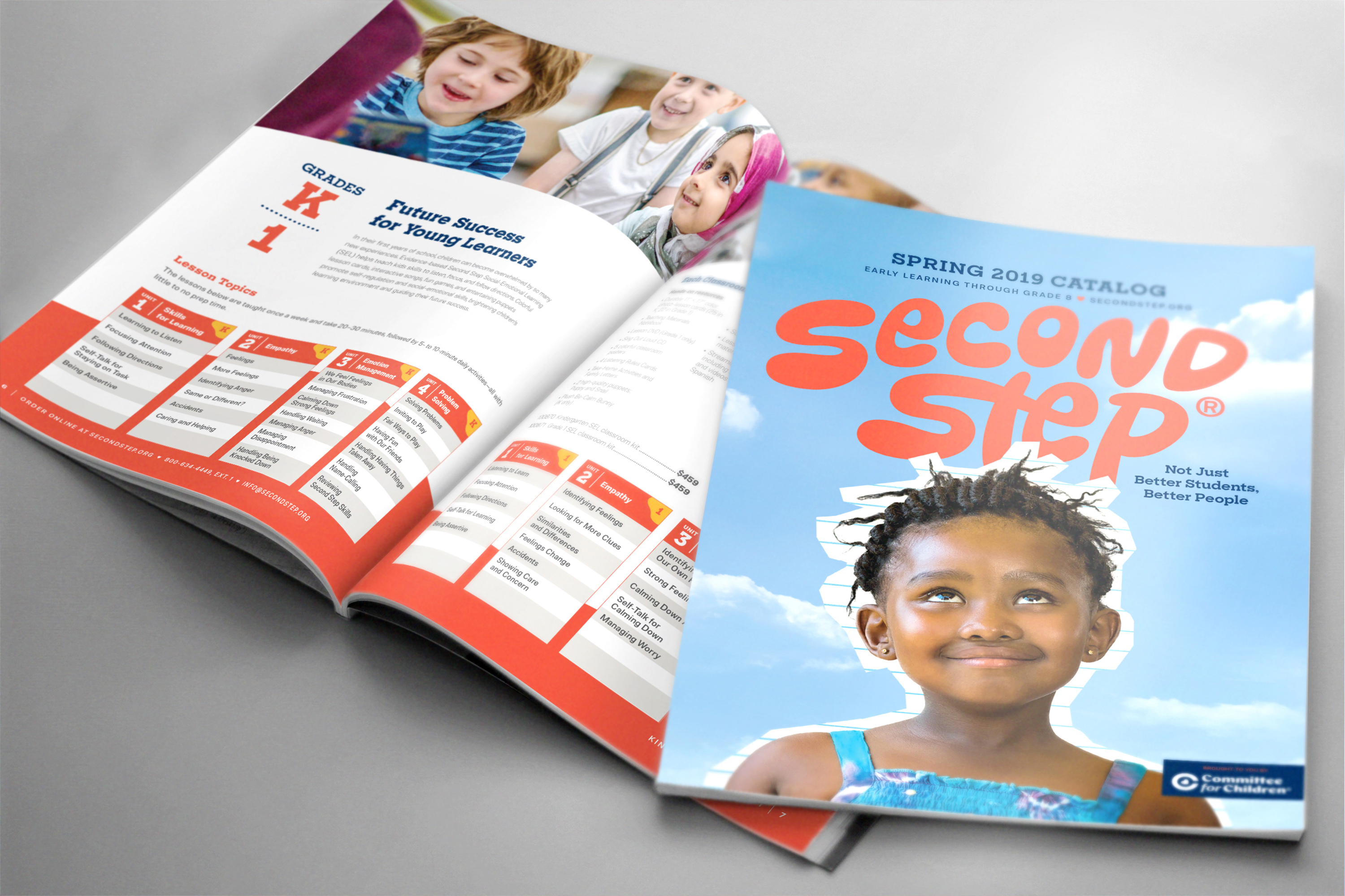
The cover introduced a brighter, more human visual direction for the Second Step catalog while keeping the brand bold and recognizable.
The catalog system was designed to make a large product lineup feel easier to understand through clearer structure, pacing, and visual hierarchy.
The opening spread helped set the tone for the catalog while giving readers clear paths into grade-level programs, additional products, pricing, and order information.
Grade-level program spreads used structured content blocks, visual charts, photography, and product details to make dense educational information more scannable.
The team spread gave the catalog a more human voice, connecting the product offering back to the people and mission behind Committee for Children.
What I owned
Why it mattered
The catalog turned a complicated curriculum and product offering into a clearer customer-facing tool. It helped educators and administrators compare programs, understand grade-level offerings, review product bundles, and navigate ordering information more easily.
Outcomes
Made a complex educational product lineup easier for educators and administrators to scan, compare, and understand.
Reworked cover, section, product, and team pages into a cleaner layout rhythm with stronger hierarchy and pacing.
Helped shape visual direction for later Committee for Children marketing materials.
Won a 2019 MarCom Gold Award for Print Media Design.